Set up a Blog and leave it to yourself, Create Part 2 Diagrams with Gnuplot
Charts do not necessarily have to be created manually with Excel, it is much more elegant: Via Gnuplot on the command line, perfect for automated applications.
Related companies
With Gnuplot it is possible to draw graphs and diagrams.
(Image: Lang/GNUplot)
In three articles on the fully automated blog – as a basis for your own developments. At the end of the first part was a list of terms and their frequencies, which are now to be rendered into a fancy graph. This second part is therefore dedicated to a true classic.
Gnuplot has been around for 35 years. In the field of science, Gnuplot is quite well known; after all, it was originally developed to be able to present mathematical functions and data interactively (in an interactive terminal). A fairly typical example of the non-interactive use of Gnuplot is weather data, as can be seen, for example, at the US-American NCAR Foothills Laboratory.
The charts on humidity, wind speed and so on are updated every five minutes – and so the site constantly provides relevant information, automatically collected by a weather station and automatically generated via Gnuplot. So here the program is used to keep a few fixed graphics simply up to date.
The operation of Gnuplot is basically simple: in the center is a configuration file that contains all the necessary instructions for creating the charts, from the size of the image, to the style of the lines and bars, to the specification of the data to be processed. The data can be available, for example, as a CSV file or in the form as produced by the first part of the series for text mining:
1885 cloud
343 git
264 kubernetes
...
Separators such as commas or spaces can be defined in the Gnuplot configuration files; and it already seems that Gnuplot may be simple in principle, but it is quite complex in detail. After all, the configurations are real small scripts that can also handle variables, macros and the like.
In order to transform really complex data into elaborate three-dimensional graphs with exact labels, dimensions, relations and legends, it takes a lot of practice. But even the introduction is not quite trivial, which is due on the one hand to the very independent approach, on the other hand to the documentation, which is not always very beginner-friendly and quite science-focused.
Why is it still worthwhile in a business context? On the one hand, it is possible to set up beautiful install-and-forget projects that could generate sales, for example, via switched advertising. On the other hand, you could also save yourself an hour or two of work in-house to manually create graphical evaluations for management with Excel & Co.
Getting started with Gnuplot
In the following, we will show you how to build a simple Gnuplot script that highlights the following concepts and elements:
- Terminal: Canvas/Drawing area
- Xtics: X-axis labeling
- Yrange: Y-axis dimension
- Label: Freely placeable lettering
For a start, this should be enough, especially since two important aspects of Gnuplot become clear, which occur again and again: coordinate systems and alignment.
Gnuplot draws the objects such as arrows and labels on different levels or in coordinate systems:
- First: Values of the X- and Y-axis (bottom, left).
- Second: Values of any secondary X/Y axes (top, right).
- Screen: The entire drawing range, addressed from 0.0 to 1.1.
- Graph: The range in the graph, addressed from 0.0 to 1.1.
- Character: Positioning on the canvas using the current font height.
Addressing from 0.0 to 1.1 simply means “from the bottom left to the top right”, so that “0.5, 0.5” defines the middle accordingly.
When placing elements in these coordinate systems, you can specify which point of the element should be on the given coordinates, i.e. set the alignment: left, center, right.
A left-aligned label “label 1” in the middle of the graph would look like this:
set label 1 „Mein beliebiger Text“ left at graph 0.5, graph 0.5
 Labels in various coordinate systems.
(Image: Lang/GNUplot)
To clarify the whole thing at least a little, here is a plot with a label placed over each coordinate system, the text corresponds to the placement:
set label 1 "at FIRST 3, 23.1"  left at first 3, first 23.1
set label 2 "at SECOND 3, 22"  left at second 3, second 22
set label 3 "at GRAPH 0.5, 0.5" left at graph 0.5, graph 0.5
set label 4 "at SCREEN 0.5, 0.48" left at screen 0.5, screen 0.48
set label 5 "at CHARACTER 35, 20" left at character 35, character 20
Gnuplot example
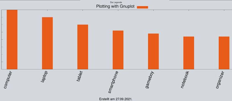
If the concept of coordinate systems, which takes some getting used to, is clear, the further configuration is quite easy; basically a pure list of set statements to set properties for objects. Before we get to the script (article.gnu), here first the data (article.dat) and the finished picture:
 Bar chart with legend and creation date.
(Image: Lang/GNUplot)
item.dat:
40 a
35 b
30 c
26 d
24 e
22 f
22 foobar
All the code for this graph looks like this:
set terminal png size 960,700 enhanced font "Helvetica,15"
set object 1 rectangle from screen 0,0 to screen 1,1 fillcolor rgb"#D5D8DC" behind
set xtics rotate by 70
set xtics right
set bmargin 5
set xtics font "Helvetica,12"
set boxwidth 0.3
set style fill solid
set key font "Helvetica,15"
set key over title "Die Legende"
set yrange [0:]
date = system("date +%d.%m.%Y")
set label 1 "Erstellt am ".date."." center at screen 0.5, screen 0.01 font "Helvetica,7"
plot "artikel.dat" using 1:xtic(2) with boxes lc rgb "#E85B19" title "Testing"
 Positions of the Gnuplot elements.
(Image: Lang/GNUplot)
Most of the elements can best be explained graphically, here again the same graph with annotations.
The series of set instructions should be largely self-explanatory, first the character area and background are created (terminal and object). In the background, a rectangle in gray, you can also see the stretching over the entire screen coordinate system from the bottom left to the top right, i.e. “0.0 to 1.1”.
In the following, X-axis lettering, bar layout, font sizes and legend are configured. Interesting is then again “set yrange [0:]“. This sets the value range of the Y-axis to zero at the lower end and “automatic” (not specified) at the upper end; a fixed range would be set with “set yrange [0:40]“ get.
The variable “date” follows: The Gnuplot command “system” can be used to execute any commands in the system shell, for example, to feed the result into a variable – here with the simple purpose of inserting an automatic creation date into the image. Now, considering that Gnuplot also allows if queries [http://gnuplot.sourceforge.net/docs_4.2/node96.html], many possibilities quickly arise!
The variable itself can then be used without any declaration, for example as text in the label element. Manual text and variables are concatenated via dots: “foo”.TAG.“bar“
But basically, all these defaults for plots could also be stored in a config file “~/.gnuplot”, the actual command for plotting follows at the end:
plot "artikel.dat" using 1:xtic(2) with boxes lc rgb "#E85B19" title "Testing"
Here is the data file to be processed (article.dat) determines how to render, i.e. here with bars (boxes) in the specified RGB line color (lc / line color) and with the set title. However, what is particularly important here is “using 1:xtic(2)”: using is used to specifically access or manipulate data within the data file (such as summation). In this case, the Y-value range is first specified, i.e. column 1. Then the label for the X-axis (xtic) is set, here column 2.
Assuming the data would look like this:
11 foo 33
22 bar 66
Then the plot command could also be used like this:
plot „artikel.dat“ using 3:xtic(2)
This would then generate the bars from the values of column 3. Further examples of the using syntax can be found in the GNUplot documentation. With the previous basic understanding, you should also quickly find your way around the manual.
With the elements shown so far, many useful and presentable diagrams can already be created, but as mentioned: Gnuplot can do much more, including calculations, the use of external scripts and, above all, targeted access to much more complex numerical material; even animations and interactive graphics are possible.
In the next part of the series, the created graphics are then automatically published script-controlled via a text-based content management system, namely the minimalist and of course open-source Pico.


