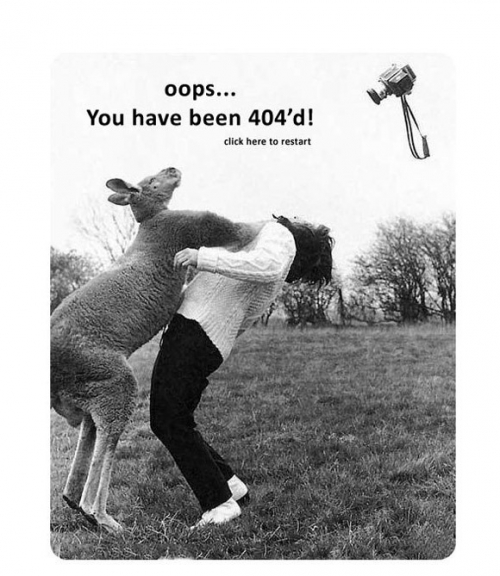
Mistakes are always perceived as an unfortunate misunderstanding, generating losses. But sometimes they can yield some benefit. For example, the so-called “error 404”, or Not Found (not found), which from time to time appears on the screen when the user tries to click on any Internet link.
Ideally, the owners of the existing sites need to keep track of broken links and get them working. But in the case of large resources to do it quickly is quite difficult. In this case it is necessary to consider how to delay the user on the website in the case if he went to a broken link. Usually the same people who saw the error, immediately go, but we do not need it.
Below are collected the most unique way to design a 404 error.
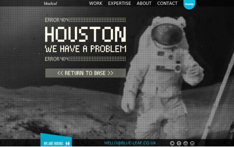
1) BlueLeaf
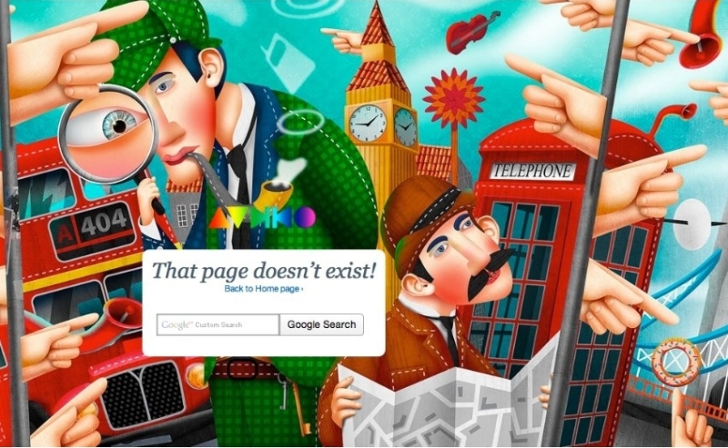
2) Audiko.net
3) Otixo
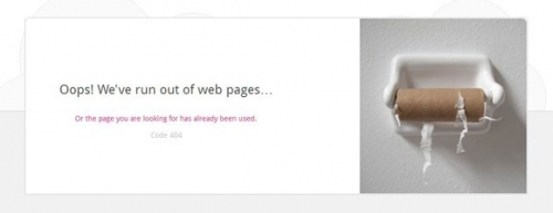
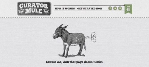
4) Curatorandmule
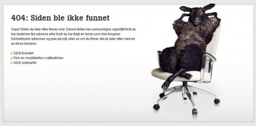
5) Tele 2
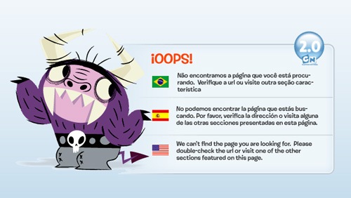
6) Cartoon Network
7) South park Studios

8) Latelategifts
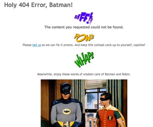
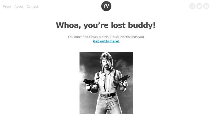
9) Rareview
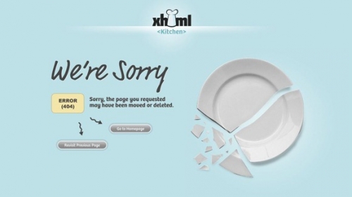
10) Xhtml Kitchen
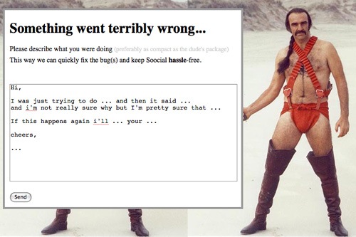
11) Soocial
11) MyTaxi

12) Local Fitness
